Thursday, 7 March 2013

Webpage ideas


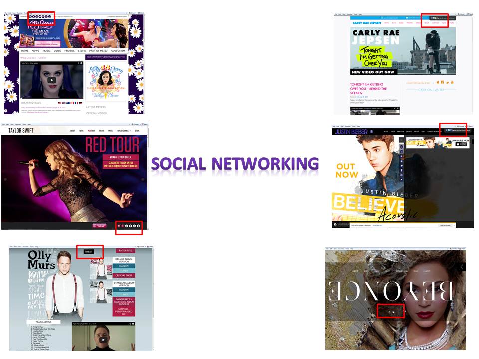
All these homepages are taken from pop artists webpages and all share conventions. The first conventions these all share are images of the artist on the homepage, for instance Beyonce's homepage is a close up of Beyonce and dominates the main screen, on Taylor Swift's homepage the images of Taylor change from pictures of her performing and then changes to images of the album cover and other version images. However on Justin Bieber's homepage he has an advertisement of his new album as the main image, Olly Murs also has an advertisement for his new album as his main image. Where as Carly Rae Jepsen and Katy Perry have advertisements of their new singles as the main image. All these artists homepages are about them and therefore the images reflect that very well.


Another convention all these webpages have are that they all have links for other options, all of the webpages have a 'store' option so that fans can go buy other merchandise and all have a 'videos' link meaning that the artists music videos or other videos are available to all. All the links have an option called 'tour' were fans are directed to a site were tickets can be bought or are taken to a site were they can keep up to date with the latest tour information and can see videos or photos from the tour. On Justin Bieber's webpage there is a link to 'chat' where fans can chat to each other around the world making it very universal and making sure fans can connect and talk about the latest information.


Another convention that these webpages have are options to share the links of these sites on social networking sites. All these sites give you the options to share the videos on your Facebook page or Twitter account. The social networking links mean that fans can share things with a wider audience meaning the artists work is more recognised but it also means free marketing for the artist as people can do this for free and it can be done of a mass scale.


Another feature of tghese webpages is that most of them have a link to iTunes were a single or album can be bought. On Justin Bieber's webpage there is flash attracting the audience to the iTunes link.On Olly Murs webpage they are 2 different links to iTunes, one been for the deluxe edition of the album and one for the standard copy of the album, this gives fans the choice between both and makes it easy to understand.

Inital images ideas

I like this image for the front cover of Taylor Swift's 'Red' album. I like the idea of having one main focus within the image and for this it is Taylor's red lips which again reflect the title of the album and therefore associate the album with the artist within the main image.

Another feature of the image I like is the netural look. The colouring is simple yet elegant is isn't draped in colour. The simplicity of the image draws the attention more. I also like how the pull focus is on the artist with the background blured making the artist stand out more.

The close up of the artist engages the audience more and diverts the attention to the artist therefore associating the image on the cover with the overall layout of the albumn cover. The close up also makes the audience feel more engaged with the artist and therefore are more likely to buy the album.

I like this image for the front cover of Justin Bieber's 'Under the Mistletoe' album. The image is very clear and the artist is centre framed with the layout of the cover. The costume of the artist is simple and the snowing affect re-establishes the Christmas album which this album is.

The image draws the audience into the front cover more because of the eye contact the artist is giving. His eyes are also striking making his eyes the main focus and because of the centre framing the audience are drawn into his eyes more.

Overall the album is a contrast to the 'Red' album cover because this has had effects added rather than the simplicity of the image of the 'Red' album cover. The effects on 'Under the Mistletoe' are relevant though and do make for good viewing pleasure and is eye catching.

This album cover is dislike. This album cover comes from DJ Calvin Harris' album 'Ready for the Weekend'. I don't like this image as it isn't associated with the artist, for example the image isn't of the artist and therefore it makes it harder to connect with the audience. The only indication that it is a Calvin Harris album would be his name and the album title on the side of cover.

However the image is clear and does draw the audience attention in because of the close up and centre framed image making it bold and stand out.


I like the cover of this album from Britney Spears' album 'Circus'. I like this image because the font of the artists name and album title follow the theme of circus. The image also refelcts an act you would see at the cirus and therefore re-inforcing the theme of the circus. The stars around the album cover also add to that affect thefore following a theme and associating the elements of the album cover to what the album is about.

The image itself is strong because of the centre framing and because of the eye contact the artist appears to have with the audience. The image is also very elegant and appears simplistic in terms of colouring of the costumes as well as the artists hair and makeup.

The colouring on the album follows and house style therefore linking the different elements together and making the album neat and easy on the eye.

 These album covers are taken from the 'Kiss' album by Carly Rae Jepsen. The first album cover was taken from the standard 'Kiss' album and the second was taken from the delux edition. I like how each album has it's own destinctive style and therefore is easier for the audience to know what album they'd prefer.

The first album and the second album both share the same image but the second ones clothing costume coloruing has been made to look less bright and the top looks a different colour to the first images. However both images are the same and in both images are providing that eye contact which connects the audience more to album and the artist.

Another feature of the album cover is the simplisity of the backdrop and the stance which Carly holds. The pose she holds is very simple but the centre framing draws the audience attention more into the image and therefore the album.


I like this album cover for Nicki Minaj 'Roman Reloaded'. I like this album cover because of the bright coloruing and busy layout. I like how the image is centre framed and how the artist is providing that eye contact with the audience drawing them in more.

The image is also reflective of the artist herself as she is general known for been exentric and is also known for bright colouring but mainly her bright coloured wigs. This album also reflects the mood of the songs on the album because they are very upbeat and dance tracks and the colouring reflects that.

Thursday, 28 February 2013

Font ideas for the digipack


For my first font ideas I used a web site 'dafont.com'. On this website you can look at different shapes and styles of fonts and genrate the text to read what you like.


This font was generated on 'dafont.com' using the square font tool. I'd seen this sort of font during my research on the album cover of Justin Bieber's albums. The song I have chosen follows the pop genre like Justin Bieber's albums also do.


This font I like because of the textual detail. I like the idea of attracting the audienes attention by using textual detail rather then a large, bold font.


I really love this font because of the girly detailing around it. I like the natured theme running around the lettering, I like this because of the natural theme used within the music video. This font is also atractive because of the way you can still see what the writing says.


This font is very bold but I have seen this font on  many album covers during my research and I do like the boldness that makes it stand out especially when an image will acompany the text on the album cover.


I like this font because of the cool style it has too it. I like the way it's simple but effective and very pretty. It reminds me of a surfer style font and therefore adding to the coolness of the font. I like the way the font drops below a certain level and therefore would shape the album cover.


I like this font as it feels personal because of the textual detail, almost as if it has been drawn by hand and therefore when put on an album cover it will feel as though the artist has drawn it herself.


This font is very sharp and has a specific shape to it making it interesting and stands out a lot more. This font has been seen on Carly Rae Jepsen's single cover of 'Call Me Maybe'. 

First draft


This is my first edited draft. The draft is incomplete as I still have some footage to film, however I uploaded this to show my progress and to show how I have more than a minute of edited footage for my A2 Media coursework. The song has been muted by Youtube due to copyright issues but I am working on getting another version uploaded with sound using another software (Vimeo). I have previously tried to gain rights to the song through my animatic but my offer was declined.

I am planning on filming the remaining of my footage over a two day period. A lot more shots in my natural location and the rest in my second location. I have also been thinking of new ideas to reflect some of the lyrics within the video. I am going to work on editing during after college to try and get as much editing time in as possible.

Rushes from shoot 2


This is the first shot out of my natural location. On the day the weather was perfect so I grasped the opportunity to film on this day. The location was quite busy but I managed to find the perfect setting without been disturbed very much, also the people around were considerate and didn't disturb the shots by walking into it and also kept very quiet.

For this shot I wanted to capture the sun coming through the trees and then tack my performer in a mid-shot. I liked how this shot went although the camera could of been more steady. I actually had to hold the camera instead of using the tripod for this shot.


For this video I wanted to get a low angle of the performer with the water behind her, however I under estimated the distance of my performer to the camera and therefore I decided upon joining my perform at the waters edge. The hill down to the waters edge was incredibly slippy and dangerous, I got the camera and tripod down safely and my performer and I got down without injury, however the tape ran out just as we were about to shoot the performer singing the song in it's entirety.


This video demonstrates my performer walking from an extreme long shot into a mid-shot through movement. In the final cut most of the walking got cut out and it ended up in a long shot rather then waiting till she got into the mid-shot.

Friday, 21 December 2012

Digipak research

As part of my A2 media advanced portfolio I have decided to design a web page for my imagined artist and a CD/ DVD package as part of my subsidiary texts.

Because I have chosen the genre of pop I have been looking at existing CD album covers as well as looking at web pages of established pop artists. I have also been looking at album covers from artists and bands of other genres.


These album covers are from the established artist Justin Bieber. The 'My World 2.0' album was Justin's second album from his 'My World Collection'. This album cover is in black and white with little colour of the name of the album therefore making the album name stand out a lot more. In the image Justin is looking directly at the audience will draws the audiences attention to the album cover and the way he's slightly leaning into the camera also makes the image draw the audience's attention in. 

In the other image of Justin's 'Believe' album we can see two different versions of the same image, the first been in black and white with again the name of the album in gold and also his name in gold at the top of the album cover. This draws the attention of the audience to the album name. The second version of the album is in colour with the album name in white, the album cover appeals more to the visual side of promotion because not only can we see colour but it makes the whole image stand out a lot more as well as the name of the album (Believe) which is kept plain but our attention is still draw too. 


These album covers are from Kings OF Leon hit album 'Come Around Sundown' the image clearly reflects the album title with an image of a sundown on the front cover. The first image is taken from the front cover of the album and the second image is the back of the album, both sides of the album clearly reflects the idea of a sundown. The album also follows a colour scheme with oranges and yellows been used all over the album. On the back of the album we can see a barcode and the music company who have produced the album which is something common among all the albums I have been looking at. A credit to the record company is always used on an album cover to show that those songs belong to that record company but most importantly the band or artist that have made the track/s. 

On the second image (the back of the album) we are shown an image of the band stood together facing a sundown. Usually album front covers will feature the artist or band because that is the main reason we consume music because of a particular band or artist, however the idea of placing an image of the band on the back is something I will consider using as it is very inventive and isn't an idea that has already been used on the market. 


This next album cover is taken from Carly Rae Jepsen's album 'Curiosity'. Carly is most known for her first single 'Call Me Maybe' which got her most recognised as an established pop music artist. Carly's music is very upbeat and holds a positive message and her album cover reflects that with the bright colouring of pink and blue, and her name standing out in the background. The image of herself is placed in the centre of the cover therefore we associate the artist with the album straight away. The image is very simplistic but again draws the audience attention in. 

This album cover appeals to me because although it is very simple the album cover itself is very eye catching and looks very sophisticated and therefore reflects the good morals of the artist behind the album. 


This next album cover is by an established well known pop artist Conor Maynard, the album is named 'Contrast'. This front cover is very similar to Carly Rae Jepsen's and Justin Bieber's album with the artist been pictured in the center of the frame. However in this image Conor isn't looking directly at the audience, he is however pulling his signature move which his fan base often copy as he is known for pulling this pose in many of his music videos or on magazine front covers. 

The colouring in this image is very simple also. The dark jacket and plain background make the image stand out more because of the black  colouring. The only bright colour used is the name of the album which is position on top of the image and spread across the front cover making it stand out a lot more than if it was positioned at the top of the album. 


This album cover is taken from Beyonce's album 'I Am Sasha Fierce'. This album is the most simple of all the album covers reviewed. Not only is there no colour used but the font doesn't much stand out against the image. However this album cover does appeal to me. I like the image because of laid back and relaxed Beyonce is made to look with minimalist makeup and a hairstyle that looks easy to replicate. The only part of the image which looks placed is the bracelet with the holy cross on, this prop was placed within the image maybe to give the affect that Beyonce is pure or to reflect the beliefs of the artist. Also the image is placed within the centre of the cover making the artist stand out a lot more. 

The font on the album cover is visible but isn't made to stand out like other album covers I have looked at. This may have been done to keep the album cover simplistic or could reflect the colouring of the bracelet worn by the artist again so we get a clear connection from the album to the artist featured on the cover. 


This album is by Cody Simpson and is called 'Paradise'. Cody Simpson is more established as a pop artist in America but has toured within the UK and other countries. Cody is not only known for his music but for his pride of been Australian. The image on the album shows Cody coming out of some water presumably on a beach, the 'I' in 'Paradise' is shaped into a palm tree giving the affect that he's making the album personal to himself and his Australian roots. Also in the image Cody is holding a guitar which he is also known for playing really well. Overall the album cover makes itself personal to the artist behind the music. Cody is positioned in the centre of the cover and is looking directly at the camera therefore drawing the audience's attention to the artist and the album more. 

The fonts are both in black and white but stand out against the image because of their position in the centre of the cover. The wording 'Paradise' slightly covers the artists name but doesn't make it hard to read but makes the album name stand out a lot more as well as connecting the album name to the artist who's name is in a larger font and spread across the cover. 


This album cover is from Demi Lovato's album 'Unbroken'. The front cover is very bold and attracts the eye of the audience because of mainly the image. Although Demi isn't looking directly at the camera we can connect with her because of the strong look in her stance and eye contact. Also the way she's positioned on the cover makes her look very dominant within the frame giving use the idea that she's in charge and posses a lot of power.

The font is all in one colour but goes with the colouring on her lips. The font is in a simple black but because of the size of the font it stands out against the light colouring of the image behind it. The words 'Demi' and 'Unbroken' are in a bold font therefore making the audience associate the album name with the artist behind the album. 

 
This album cover is taken from Calvin Harris' latest album '18 Months'. With this album cover it's simple and effective, I like the way the text is positioned in the middle of the album and the artists image placed at the bottom. I like the backdrop of the location with the wall and the house satellite dishes in the background. The simplicity of this album cover makes it more interesting and kind of makes it more eye catching because it is simple, with the album name and artist on the front makes for an album cover which isn't busy and is readable.

Thursday, 6 December 2012

Rushes and Outtakes

This was an outtake from my music video. This video was created to show the production side to creating my music video. In this video the performer forgets an action cue and notices the mistake herself.


This is another outtake and again is used to show the production side of making my music video. In this video the performer gets the words confused and therefore I had to give her a reminder of the lyrics. However the performer was well aware of the mistake herself.


This is another outtake from the production process of my music video. In this video the performer also messes up the lyrics and again I had to remind her of the lyrics. The performer was again aware of the mistake and listened to all advice I gave her so that she didn't get the lyrics confused again. 


This video is another outtake but this time I managed to mess up by moving the camera, I accidently moved the cameras angle whilst turning on the music in the background. I hadn't noticed the mistake until my performer informed me.


This video is a rush and hasn't been edited yet. In this video I used the green screen so that I can use a smoke effect during the editing stage.


This video is another rush and hasn't been edited yet. For this video I am intending to turn the image black and white to reflect her mood and also adding a dissolve to the next shot.