Friday, 15 March 2013

Making my webpage


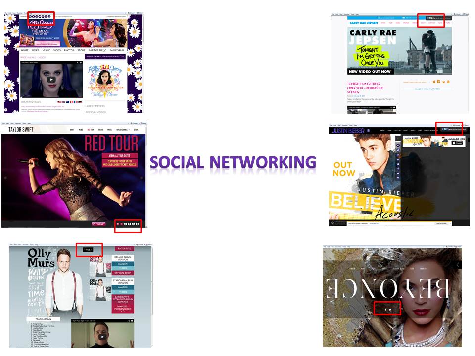
I have decided to use WiX web design as a place to design my final webpage. It's free, quick and easy and offers alot of help for those who need it. It's easy to sign up to, all is needed is an email address and a password and for you to choose a layout design based on a theme. I like the layout of WiX as it's easy to follow and simple to do.
 
 
This is the second stage after creating an account. This stage asks you to chose a template design based on the purpose of the webpage. After I'd clicked 'Entertainment' and 'Band or Artsist' I was directed to this page were I had to pick a web design.
 
 
After clicking my web design I was taken to the layout of my webpage. WiX loaded it which didn't take long and I was free to start editing. The layout loaded and I was offered to watch a video explaining how to start editing.
 
 
I started my editing by looking at the 'info' part of the navigator systems. I am also going to edit the homepage, info, contact and gallery section of my webpage.
 
 
Whilst creating my webpage 'info' navigator I released that I needed to come up with a previous album name and therefore used google to find an 'album name generator' I was located to this site (http://www.songname.net/names.html) to generate an album name to which I came up with 'A Sense Of Happiness'.
 
This is the first draft of my infortmation page on my webpage. I have created an information pack based on my made up artist 'Ella'. If this changes I will be able to edit the information page to save the changes.


This is me editing my 'Latest News' forum to update fans about the latest news of my artist. WiX makes it easy to do as it provides many options for me to change the colour and font of the text and to provide clear headings.
 
 
I have edited the 'Tour News' part of the homepage. I have included 3 seperate concerts other than Ella's tour and have also included a seperate box for her specific tour dates.

This is my first edited draft of my tour page on my website. I like the use of the flags as visual imagery and I also like the descriptions used in the tour news info section. The images are all found images and have been blogged on a seperate post. 
 
 
On my blog there was a navigator for a 'contact' page. I decided, because of research into webpages, that I was going to change the contact page into a chairty page. I researched some charites and came up with the chairty 'Pencils of Promise' as I am a follower of the chairty. The idea of me having a chairty page appealed to me more as not many of the webpages I had looked into had a contacts page but all had a charity page.
 
For the artists social network page I googled 'Create a fake tweet' in order to present a tweet sent by the artist via her twitter account.
The website I used to make a fake tweet.
 
 
This image shows the edited version on my 'Music' page. For this page I added an albums listing of the tracks on the album. I also added a download page were I added my download image from iTunes of my album on the 'top downloades' page. I am going to add a buy album option.
 

Wednesday, 13 March 2013

Examples of photoshoots

I have been looking into what it takes to get the perfect album cover image. I have been looking at videos but on YouTube by established artists to gain some inspiration. I have also looked at magazine photoshoot to also gain more of an idea of what needs to be considered for the photoshoot.

These first five videos are taken from One Directions 'Take Me Home' cover shoot were the boys uploaded a new video in the lead up to the album, doing this attracted the audience more and drew attention to the fact that the album was soon to be released. These videos acted as a teaser and kept audiences interested in the release of the album.


This is Niall's video which was uploaded 6 days before the album release. Each video represents one day closer to the albums release and therefore the fans have a count down to the day. In this video we see how many locations and different ideas for set ups are thought about. We also see one problem that can occur due to shooting outside; the weather. In this video we also see how the boys are changed into various costumes to fit with the various range of ideas that come from the shoot.


This was the second video uploaded but this time Louis takes the leading role introducing the photshoot. In this video we see how Louis explains the location they have chosen as well as talking about their various costume changes. We also see one of the locations of a bus were he explains that they are trying to capture 'fun' in the images.


This video comes courtesy of Zayn as he explains the early start to the photoshoot. He also talks about the progression of this album and how the boys are looking forward to the release of the album. In this video Zayn is showing the fun side to making the album cover keeping the fans entertained and showing the bands sense of humour which they are all known for.


In this video we see Liam explaining the querciness of the shoot and how the boys are trying to reflect their 'Britishness' throughout the shots. In the video he also hightlight the potential health hazrds, such as climbing on the phone box and of course this needs to be considered when I do my photoshoot.


This video was the last video to be released the day before the album release. This video comes cuortesy of Harry.Again this video just explains the concept of the shoot and again shows the hard work involved in making the shoot successful. In this video we also see how they take the album title 'Take Me Home' as a reflections of their international success and the British theme again reflects the album title.


This next video comes from Kelly Rowland's album cover. In this videos we see the people who are involved in the process from hair and makeup to costume and directors. The video shows the different outfits which are used for the shoot but this album cover is shot in one location, against a white backdrop.

Thursday, 7 March 2013

Webpage ideas


All these homepages are taken from pop artists webpages and all share conventions. The first conventions these all share are images of the artist on the homepage, for instance Beyonce's homepage is a close up of Beyonce and dominates the main screen, on Taylor Swift's homepage the images of Taylor change from pictures of her performing and then changes to images of the album cover and other version images. However on Justin Bieber's homepage he has an advertisement of his new album as the main image, Olly Murs also has an advertisement for his new album as his main image. Where as Carly Rae Jepsen and Katy Perry have advertisements of their new singles as the main image. All these artists homepages are about them and therefore the images reflect that very well.


Another convention all these webpages have are that they all have links for other options, all of the webpages have a 'store' option so that fans can go buy other merchandise and all have a 'videos' link meaning that the artists music videos or other videos are available to all. All the links have an option called 'tour' were fans are directed to a site were tickets can be bought or are taken to a site were they can keep up to date with the latest tour information and can see videos or photos from the tour. On Justin Bieber's webpage there is a link to 'chat' where fans can chat to each other around the world making it very universal and making sure fans can connect and talk about the latest information.


Another convention that these webpages have are options to share the links of these sites on social networking sites. All these sites give you the options to share the videos on your Facebook page or Twitter account. The social networking links mean that fans can share things with a wider audience meaning the artists work is more recognised but it also means free marketing for the artist as people can do this for free and it can be done of a mass scale.


Another feature of tghese webpages is that most of them have a link to iTunes were a single or album can be bought. On Justin Bieber's webpage there is flash attracting the audience to the iTunes link.On Olly Murs webpage they are 2 different links to iTunes, one been for the deluxe edition of the album and one for the standard copy of the album, this gives fans the choice between both and makes it easy to understand.

Inital images ideas

I like this image for the front cover of Taylor Swift's 'Red' album. I like the idea of having one main focus within the image and for this it is Taylor's red lips which again reflect the title of the album and therefore associate the album with the artist within the main image.

Another feature of the image I like is the netural look. The colouring is simple yet elegant is isn't draped in colour. The simplicity of the image draws the attention more. I also like how the pull focus is on the artist with the background blured making the artist stand out more.

The close up of the artist engages the audience more and diverts the attention to the artist therefore associating the image on the cover with the overall layout of the albumn cover. The close up also makes the audience feel more engaged with the artist and therefore are more likely to buy the album.

I like this image for the front cover of Justin Bieber's 'Under the Mistletoe' album. The image is very clear and the artist is centre framed with the layout of the cover. The costume of the artist is simple and the snowing affect re-establishes the Christmas album which this album is.

The image draws the audience into the front cover more because of the eye contact the artist is giving. His eyes are also striking making his eyes the main focus and because of the centre framing the audience are drawn into his eyes more.

Overall the album is a contrast to the 'Red' album cover because this has had effects added rather than the simplicity of the image of the 'Red' album cover. The effects on 'Under the Mistletoe' are relevant though and do make for good viewing pleasure and is eye catching.

This album cover is dislike. This album cover comes from DJ Calvin Harris' album 'Ready for the Weekend'. I don't like this image as it isn't associated with the artist, for example the image isn't of the artist and therefore it makes it harder to connect with the audience. The only indication that it is a Calvin Harris album would be his name and the album title on the side of cover.

However the image is clear and does draw the audience attention in because of the close up and centre framed image making it bold and stand out.


I like the cover of this album from Britney Spears' album 'Circus'. I like this image because the font of the artists name and album title follow the theme of circus. The image also refelcts an act you would see at the cirus and therefore re-inforcing the theme of the circus. The stars around the album cover also add to that affect thefore following a theme and associating the elements of the album cover to what the album is about.

The image itself is strong because of the centre framing and because of the eye contact the artist appears to have with the audience. The image is also very elegant and appears simplistic in terms of colouring of the costumes as well as the artists hair and makeup.

The colouring on the album follows and house style therefore linking the different elements together and making the album neat and easy on the eye.

 These album covers are taken from the 'Kiss' album by Carly Rae Jepsen. The first album cover was taken from the standard 'Kiss' album and the second was taken from the delux edition. I like how each album has it's own destinctive style and therefore is easier for the audience to know what album they'd prefer.

The first album and the second album both share the same image but the second ones clothing costume coloruing has been made to look less bright and the top looks a different colour to the first images. However both images are the same and in both images are providing that eye contact which connects the audience more to album and the artist.

Another feature of the album cover is the simplisity of the backdrop and the stance which Carly holds. The pose she holds is very simple but the centre framing draws the audience attention more into the image and therefore the album.


I like this album cover for Nicki Minaj 'Roman Reloaded'. I like this album cover because of the bright coloruing and busy layout. I like how the image is centre framed and how the artist is providing that eye contact with the audience drawing them in more.

The image is also reflective of the artist herself as she is general known for been exentric and is also known for bright colouring but mainly her bright coloured wigs. This album also reflects the mood of the songs on the album because they are very upbeat and dance tracks and the colouring reflects that.

Thursday, 28 February 2013

Font ideas for the digipack


For my first font ideas I used a web site 'dafont.com'. On this website you can look at different shapes and styles of fonts and genrate the text to read what you like.


This font was generated on 'dafont.com' using the square font tool. I'd seen this sort of font during my research on the album cover of Justin Bieber's albums. The song I have chosen follows the pop genre like Justin Bieber's albums also do.


This font I like because of the textual detail. I like the idea of attracting the audienes attention by using textual detail rather then a large, bold font.


I really love this font because of the girly detailing around it. I like the natured theme running around the lettering, I like this because of the natural theme used within the music video. This font is also atractive because of the way you can still see what the writing says.


This font is very bold but I have seen this font on  many album covers during my research and I do like the boldness that makes it stand out especially when an image will acompany the text on the album cover.


I like this font because of the cool style it has too it. I like the way it's simple but effective and very pretty. It reminds me of a surfer style font and therefore adding to the coolness of the font. I like the way the font drops below a certain level and therefore would shape the album cover.


I like this font as it feels personal because of the textual detail, almost as if it has been drawn by hand and therefore when put on an album cover it will feel as though the artist has drawn it herself.


This font is very sharp and has a specific shape to it making it interesting and stands out a lot more. This font has been seen on Carly Rae Jepsen's single cover of 'Call Me Maybe'. 

First draft


This is my first edited draft. The draft is incomplete as I still have some footage to film, however I uploaded this to show my progress and to show how I have more than a minute of edited footage for my A2 Media coursework. The song has been muted by Youtube due to copyright issues but I am working on getting another version uploaded with sound using another software (Vimeo). I have previously tried to gain rights to the song through my animatic but my offer was declined.

I am planning on filming the remaining of my footage over a two day period. A lot more shots in my natural location and the rest in my second location. I have also been thinking of new ideas to reflect some of the lyrics within the video. I am going to work on editing during after college to try and get as much editing time in as possible.

Rushes from shoot 2


This is the first shot out of my natural location. On the day the weather was perfect so I grasped the opportunity to film on this day. The location was quite busy but I managed to find the perfect setting without been disturbed very much, also the people around were considerate and didn't disturb the shots by walking into it and also kept very quiet.

For this shot I wanted to capture the sun coming through the trees and then tack my performer in a mid-shot. I liked how this shot went although the camera could of been more steady. I actually had to hold the camera instead of using the tripod for this shot.


For this video I wanted to get a low angle of the performer with the water behind her, however I under estimated the distance of my performer to the camera and therefore I decided upon joining my perform at the waters edge. The hill down to the waters edge was incredibly slippy and dangerous, I got the camera and tripod down safely and my performer and I got down without injury, however the tape ran out just as we were about to shoot the performer singing the song in it's entirety.


This video demonstrates my performer walking from an extreme long shot into a mid-shot through movement. In the final cut most of the walking got cut out and it ended up in a long shot rather then waiting till she got into the mid-shot.