Believe- Inspired by Justin Bieber's Believe album
Red- Inspired by Taylor Swift's Red album
Unbroken- Inspired by Demi Lovato's Unbroken album
Wednesday, 20 March 2013

Image inspirations
I have been deciding on some image ideas to start taking my images. I have been looking at album covers and have noticed the close ups used on the album covers. The album I have been looking at most is Taylor Swifts 'Red' album. I have been looking at fan made 'Red' album covers also because they used most the images taken for the 'Red' album but weren't used.
For my album cover I want it too be simply yet sophisticated and choosing to look at Taylor Swift's album cover has influenced my idea of sophistication. I like the idea that she used be calling her album 'Red' and the image is a close up of her with red lipstick therefore linking the album cover to the image on the cover.
 This album cover oozes sophistication and simplicity, yet it's elegant and beautiful and really attracts the audiences attention by using the close up of Taylor and by linking the album name (Red) to a colour that Taylor is wearing (her red lipstick). I like this album cover as an idea for an image as I like the way the close up makes the artist more intimate with the audience. The use of cinematography (the close up) and mise-en-scene (the lipstick) has made this album cover visually appealing to a target market.
Also the image looks as though her eyes are shawdowed and therefore attracting the attention of the audience to her lips more as they are in the light and replicate the colour.
Red also connotates passion and love, this could be a connotation of Taylor's passion for music and love for the work she does.

This is a fan version of the album cover, however I like the idea of this. I like the close up still be used but I also like the way the 'RED' initals have been edited over the image still reflecting the red colour scheme and therefore still linking the image to the album cover and album title.
This album cover has used a lot more editing techniques to achieve the final look. It still keeps the sophistication of the image but making to more eye catching with the use of the colour red been more dominante upon the overall album cover.
 I like this album cover as I like the way Demi looks really dominante within the frame and the angle of the image reinforces that. I like the makeup as it adds to her sassiness and makes her look more appealing in terms of look madeup.
This album cover reflects more of the codes and coventions of the pop genre as Demi is more madeup in terms of makeup and mise-en-scene use.
The lighting on the left side of her face makes her look more angelic and is visually more appealing or reflects the idea of 'there is light at the end of the tunnel' which is the basic message of the album.

For my album cover I want it too be simply yet sophisticated and choosing to look at Taylor Swift's album cover has influenced my idea of sophistication. I like the idea that she used be calling her album 'Red' and the image is a close up of her with red lipstick therefore linking the album cover to the image on the cover.
 This album cover oozes sophistication and simplicity, yet it's elegant and beautiful and really attracts the audiences attention by using the close up of Taylor and by linking the album name (Red) to a colour that Taylor is wearing (her red lipstick). I like this album cover as an idea for an image as I like the way the close up makes the artist more intimate with the audience. The use of cinematography (the close up) and mise-en-scene (the lipstick) has made this album cover visually appealing to a target market.
 Also the image looks as though her eyes are shawdowed and therefore attracting the attention of the audience to her lips more as they are in the light and replicate the colour.
Red also connotates passion and love, this could be a connotation of Taylor's passion for music and love for the work she does.

This is a fan version of the album cover, however I like the idea of this. I like the close up still be used but I also like the way the 'RED' initals have been edited over the image still reflecting the red colour scheme and therefore still linking the image to the album cover and album title.
This album cover has used a lot more editing techniques to achieve the final look. It still keeps the sophistication of the image but making to more eye catching with the use of the colour red been more dominante upon the overall album cover.
Another artists album covers I looked at were Demi Lovato album covers. The song I used in my music video was taken from Demi's album 'Unbroken' and therefore I decided to look to see the route Demi had taken with the overall affect of the single cover and then the album cover.
On the 'Skyscraper' single cover Demi has stripped back in terms of mise-en-scene and hair and makeup. In the image Demi looks almost natural as her makeup is kept very minimalistic and the background of the image is a natural location and isn't over done with bright lights and neon colours which would usually be seen as convention of the pop genre. The image on the single cover very much reflects the meaning and sound of the song, it's very stripped back and is beautifully simple.
The overall album cover 'Unbroken' is again in a natural location but Demi has used a dark coloured lipstick and more costume props to help give the affect that she's strong and dominat. Even the angle of the image, a low angle, reflects her dominante stance. The image and the look very much reflect the meaning of the album and therefore work really well with one another.

This album cover reflects more of the codes and coventions of the pop genre as Demi is more madeup in terms of makeup and mise-en-scene use.
The lighting on the left side of her face makes her look more angelic and is visually more appealing or reflects the idea of 'there is light at the end of the tunnel' which is the basic message of the album.
I like this single cover as again it's simply beautiful and sophisticated. The image is positioned slightly left of the frame leaving room for the naturla location in the background visible but a little out of focus, furthermore the pull focus draws the audiences attention to the artist and therefore associating the album and the artist more visually.
Her eyes are also like she's looking into the audience and therefore draws the attention to the artists eyes rather then the backrgound.
The colouring in this single cover are very neutral colours and add to the simplicity and go against the typical coventions of a brightly coloured pop album cover.
Monday, 18 March 2013
Images used on my webpage

I used this image as part of the 'Latest News' forum as this image related to a concert been performed by my artsist at Madison Square Garden. This image is my own, taken by myself.

This image is a found image which I searched in Google. I got this image through this website: http://www.free-theme-songs.com/tvtunes/images/5/the-ellen-degeneres-show.jpg


I used this image on my 'Tour' part of the webpage. This image was taken off google through the Madison Square Garden home page, this image was taken from Justin Bieber's concert back in 2012 so the image was found through the images of that night.

This flag acted as an imagery for my US tour part of 'Tour News'.

This flag again acted as an imagery for my UK tour part of 'Tour News'

This again will act as imagery for the 'Tour News' section on my webpage.


Again these images have been used on the tour section of my website and I have used them as a visual aid alongside the written infortmation. These images where found.

This logo is from the charity page on my website. I have chosen the chairty Pencils of Promise as I myself are directly involved in the chairty and therefore decided to us it.

This is my album cover so is used on the homepage of my website. I took the image and edited myself so no credit is needed.

This image is repeated twice on my webpage. It is used in the gallery section and thd gallery section on my homepage.

This image is used on the gallery section and the gallery section of my homepage also. I have taken this images so no credit is needed.

I have used this image on my 'Music' page. I have used this image to reflect a download and therefore this would show iTunes (top download site).
The original image came from: www.question-defense.com

I am going to use this iTunes logo on my downloads page as a way of giving a visual for the download sites were you can download my track.
Friday, 15 March 2013
Making my webpage

I have decided to use WiX web design as a place to design my final webpage. It's free, quick and easy and offers alot of help for those who need it. It's easy to sign up to, all is needed is an email address and a password and for you to choose a layout design based on a theme. I like the layout of WiX as it's easy to follow and simple to do.

This is the second stage after creating an account. This stage asks you to chose a template design based on the purpose of the webpage. After I'd clicked 'Entertainment' and 'Band or Artsist' I was directed to this page were I had to pick a web design.

After clicking my web design I was taken to the layout of my webpage. WiX loaded it which didn't take long and I was free to start editing. The layout loaded and I was offered to watch a video explaining how to start editing.

I started my editing by looking at the 'info' part of the navigator systems. I am also going to edit the homepage, info, contact and gallery section of my webpage.

Whilst creating my webpage 'info' navigator I released that I needed to come up with a previous album name and therefore used google to find an 'album name generator' I was located to this site (http://www.songname.net/names.html) to generate an album name to which I came up with 'A Sense Of Happiness'.

This is the first draft of my infortmation page on my webpage. I have created an information pack based on my made up artist 'Ella'. If this changes I will be able to edit the information page to save the changes.

This is me editing my 'Latest News' forum to update fans about the latest news of my artist. WiX makes it easy to do as it provides many options for me to change the colour and font of the text and to provide clear headings.

I have edited the 'Tour News' part of the homepage. I have included 3 seperate concerts other than Ella's tour and have also included a seperate box for her specific tour dates.

This is my first edited draft of my tour page on my website. I like the use of the flags as visual imagery and I also like the descriptions used in the tour news info section. The images are all found images and have been blogged on a seperate post.

On my blog there was a navigator for a 'contact' page. I decided, because of research into webpages, that I was going to change the contact page into a chairty page. I researched some charites and came up with the chairty 'Pencils of Promise' as I am a follower of the chairty. The idea of me having a chairty page appealed to me more as not many of the webpages I had looked into had a contacts page but all had a charity page.

For the artists social network page I googled 'Create a fake tweet' in order to present a tweet sent by the artist via her twitter account.

The website I used to make a fake tweet.

This image shows the edited version on my 'Music' page. For this page I added an albums listing of the tracks on the album. I also added a download page were I added my download image from iTunes of my album on the 'top downloades' page. I am going to add a buy album option.
Wednesday, 13 March 2013
Examples of photoshoots
I have been looking into what it takes to get the perfect album cover image. I have been looking at videos but on YouTube by established artists to gain some inspiration. I have also looked at magazine photoshoot to also gain more of an idea of what needs to be considered for the photoshoot.
These first five videos are taken from One Directions 'Take Me Home' cover shoot were the boys uploaded a new video in the lead up to the album, doing this attracted the audience more and drew attention to the fact that the album was soon to be released. These videos acted as a teaser and kept audiences interested in the release of the album.
This is Niall's video which was uploaded 6 days before the album release. Each video represents one day closer to the albums release and therefore the fans have a count down to the day. In this video we see how many locations and different ideas for set ups are thought about. We also see one problem that can occur due to shooting outside; the weather. In this video we also see how the boys are changed into various costumes to fit with the various range of ideas that come from the shoot.
This was the second video uploaded but this time Louis takes the leading role introducing the photshoot. In this video we see how Louis explains the location they have chosen as well as talking about their various costume changes. We also see one of the locations of a bus were he explains that they are trying to capture 'fun' in the images.
This video comes courtesy of Zayn as he explains the early start to the photoshoot. He also talks about the progression of this album and how the boys are looking forward to the release of the album. In this video Zayn is showing the fun side to making the album cover keeping the fans entertained and showing the bands sense of humour which they are all known for.
In this video we see Liam explaining the querciness of the shoot and how the boys are trying to reflect their 'Britishness' throughout the shots. In the video he also hightlight the potential health hazrds, such as climbing on the phone box and of course this needs to be considered when I do my photoshoot.
This video was the last video to be released the day before the album release. This video comes cuortesy of Harry.Again this video just explains the concept of the shoot and again shows the hard work involved in making the shoot successful. In this video we also see how they take the album title 'Take Me Home' as a reflections of their international success and the British theme again reflects the album title.
This next video comes from Kelly Rowland's album cover. In this videos we see the people who are involved in the process from hair and makeup to costume and directors. The video shows the different outfits which are used for the shoot but this album cover is shot in one location, against a white backdrop.
These first five videos are taken from One Directions 'Take Me Home' cover shoot were the boys uploaded a new video in the lead up to the album, doing this attracted the audience more and drew attention to the fact that the album was soon to be released. These videos acted as a teaser and kept audiences interested in the release of the album.
This is Niall's video which was uploaded 6 days before the album release. Each video represents one day closer to the albums release and therefore the fans have a count down to the day. In this video we see how many locations and different ideas for set ups are thought about. We also see one problem that can occur due to shooting outside; the weather. In this video we also see how the boys are changed into various costumes to fit with the various range of ideas that come from the shoot.
This was the second video uploaded but this time Louis takes the leading role introducing the photshoot. In this video we see how Louis explains the location they have chosen as well as talking about their various costume changes. We also see one of the locations of a bus were he explains that they are trying to capture 'fun' in the images.
This video comes courtesy of Zayn as he explains the early start to the photoshoot. He also talks about the progression of this album and how the boys are looking forward to the release of the album. In this video Zayn is showing the fun side to making the album cover keeping the fans entertained and showing the bands sense of humour which they are all known for.
In this video we see Liam explaining the querciness of the shoot and how the boys are trying to reflect their 'Britishness' throughout the shots. In the video he also hightlight the potential health hazrds, such as climbing on the phone box and of course this needs to be considered when I do my photoshoot.
This video was the last video to be released the day before the album release. This video comes cuortesy of Harry.Again this video just explains the concept of the shoot and again shows the hard work involved in making the shoot successful. In this video we also see how they take the album title 'Take Me Home' as a reflections of their international success and the British theme again reflects the album title.
This next video comes from Kelly Rowland's album cover. In this videos we see the people who are involved in the process from hair and makeup to costume and directors. The video shows the different outfits which are used for the shoot but this album cover is shot in one location, against a white backdrop.
Thursday, 7 March 2013
Webpage ideas

All these homepages are taken from pop artists webpages and all share conventions. The first conventions these all share are images of the artist on the homepage, for instance Beyonce's homepage is a close up of Beyonce and dominates the main screen, on Taylor Swift's homepage the images of Taylor change from pictures of her performing and then changes to images of the album cover and other version images. However on Justin Bieber's homepage he has an advertisement of his new album as the main image, Olly Murs also has an advertisement for his new album as his main image. Where as Carly Rae Jepsen and Katy Perry have advertisements of their new singles as the main image. All these artists homepages are about them and therefore the images reflect that very well.

Another convention all these webpages have are that they all have links for other options, all of the webpages have a 'store' option so that fans can go buy other merchandise and all have a 'videos' link meaning that the artists music videos or other videos are available to all. All the links have an option called 'tour' were fans are directed to a site were tickets can be bought or are taken to a site were they can keep up to date with the latest tour information and can see videos or photos from the tour. On Justin Bieber's webpage there is a link to 'chat' where fans can chat to each other around the world making it very universal and making sure fans can connect and talk about the latest information.
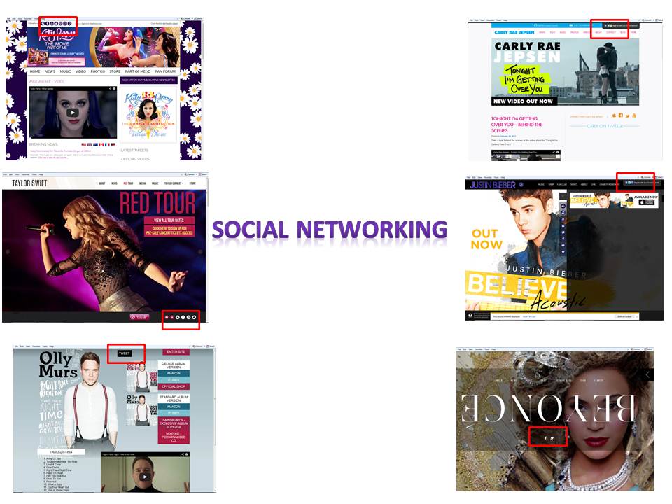
Another convention that these webpages have are options to share the links of these sites on social networking sites. All these sites give you the options to share the videos on your Facebook page or Twitter account. The social networking links mean that fans can share things with a wider audience meaning the artists work is more recognised but it also means free marketing for the artist as people can do this for free and it can be done of a mass scale.

Another feature of tghese webpages is that most of them have a link to iTunes were a single or album can be bought. On Justin Bieber's webpage there is flash attracting the audience to the iTunes link.On Olly Murs webpage they are 2 different links to iTunes, one been for the deluxe edition of the album and one for the standard copy of the album, this gives fans the choice between both and makes it easy to understand.
Inital images ideas

Another feature of the image I like is the netural look. The colouring is simple yet elegant is isn't draped in colour. The simplicity of the image draws the attention more. I also like how the pull focus is on the artist with the background blured making the artist stand out more.
The close up of the artist engages the audience more and diverts the attention to the artist therefore associating the image on the cover with the overall layout of the albumn cover. The close up also makes the audience feel more engaged with the artist and therefore are more likely to buy the album.

The image draws the audience into the front cover more because of the eye contact the artist is giving. His eyes are also striking making his eyes the main focus and because of the centre framing the audience are drawn into his eyes more.
Overall the album is a contrast to the 'Red' album cover because this has had effects added rather than the simplicity of the image of the 'Red' album cover. The effects on 'Under the Mistletoe' are relevant though and do make for good viewing pleasure and is eye catching.

However the image is clear and does draw the audience attention in because of the close up and centre framed image making it bold and stand out.

The image itself is strong because of the centre framing and because of the eye contact the artist appears to have with the audience. The image is also very elegant and appears simplistic in terms of colouring of the costumes as well as the artists hair and makeup.
The colouring on the album follows and house style therefore linking the different elements together and making the album neat and easy on the eye.

The first album and the second album both share the same image but the second ones clothing costume coloruing has been made to look less bright and the top looks a different colour to the first images. However both images are the same and in both images are providing that eye contact which connects the audience more to album and the artist.

Another feature of the album cover is the simplisity of the backdrop and the stance which Carly holds. The pose she holds is very simple but the centre framing draws the audience attention more into the image and therefore the album.

The image is also reflective of the artist herself as she is general known for been exentric and is also known for bright colouring but mainly her bright coloured wigs. This album also reflects the mood of the songs on the album because they are very upbeat and dance tracks and the colouring reflects that.
Subscribe to:
Posts (Atom)